By Joanthan Adler, The Playful Modernist
Witty, irreverent, fun. He makes you laugh while making you think about your lamp.
Hey friends! We’ve all done it — stepped back from a room and thought, “Wait… why does this look so off?” Some design mistakes are legendary for how common (and hilarious) they are. The good news? They’re easy to spot and even easier to fix once you know what to look for.
Here are some of the funniest (and most frequent) design slip-ups I see, plus how to avoid them in 2026.
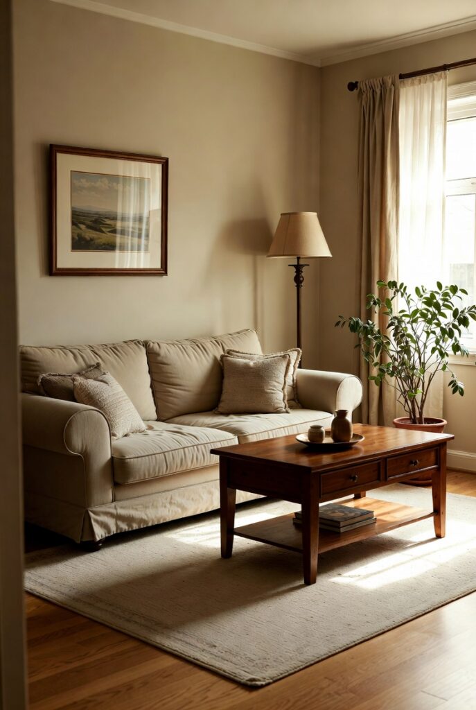
The Matchy-Matchy Syndrome
You buy the entire matching set — sofa, loveseat, chairs, tables — all from the same collection. It feels safe, but the room ends up looking like a furniture showroom instead of a home.
Fix: Mix pieces from different eras and styles. Pair a modern sofa with vintage side tables or an antique armchair with a contemporary coffee table. The contrast makes the space feel collected and personal.
Hanging Art Too High
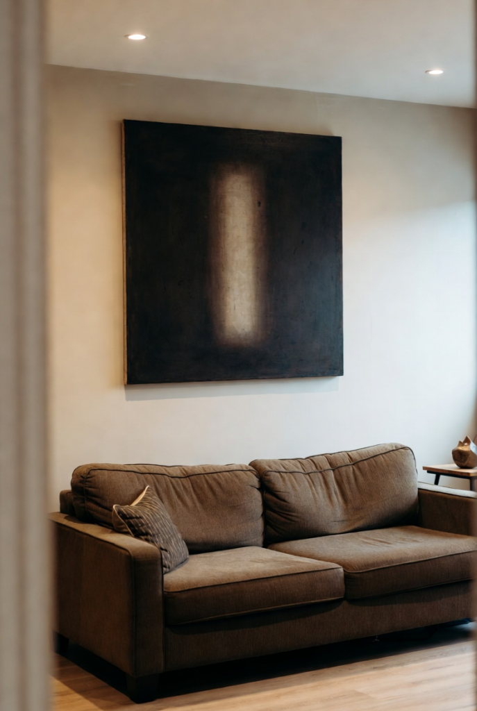
This one is so common it’s almost a rite of passage. Art floating near the ceiling makes the room feel disconnected and the furniture look short.
Fix: Hang artwork so the center is roughly at eye level (about 57–60 inches from the floor). When hanging above furniture, keep the bottom of the piece 6–12 inches above the top of the sofa or console.
The Floating Tiny Rug
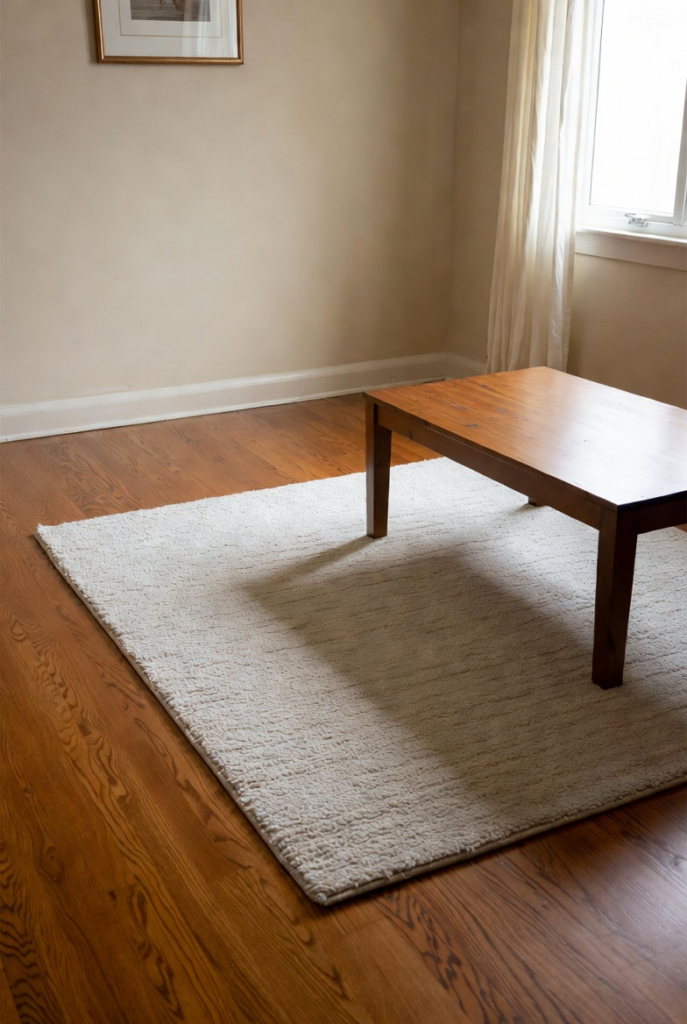
A small rug that only sits under the coffee table (with all the furniture legs off the rug) makes the room feel disjointed and smaller.
Fix: Choose a rug large enough so that at least the front legs of your main seating pieces sit on it. In living rooms, the rug should anchor the entire conversation area.
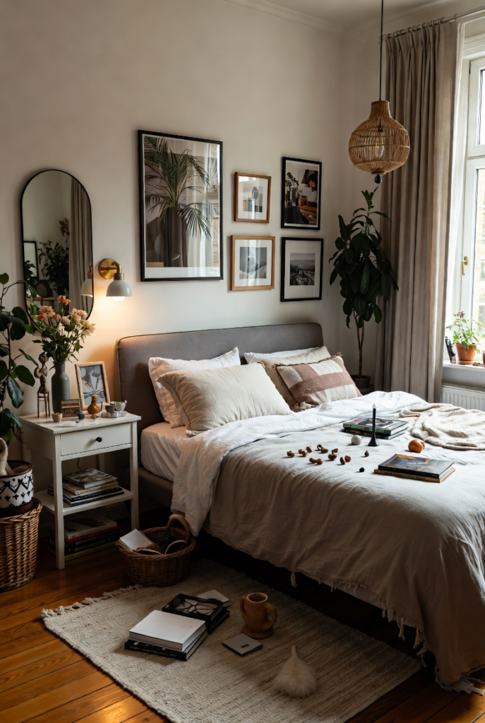
Too Many Tiny Accessories
Tiny figurines, small candles, and little knick-knacks scattered everywhere create visual clutter and make a room feel busy and smaller.
Fix: Edit ruthlessly. Group items in odd numbers (3 or 5), vary heights and scale, and leave plenty of breathing room. Bigger, fewer pieces have way more impact.
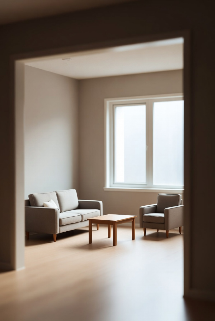
Everything Is Mini
Using only small-scale furniture and accessories in a normal-sized room makes everything look dollhouse-ish and leaves the space feeling empty.
Fix: Mix scales. Combine one or two oversized statement pieces (a big sofa, tall floor lamp, or large art) with smaller items for balance.
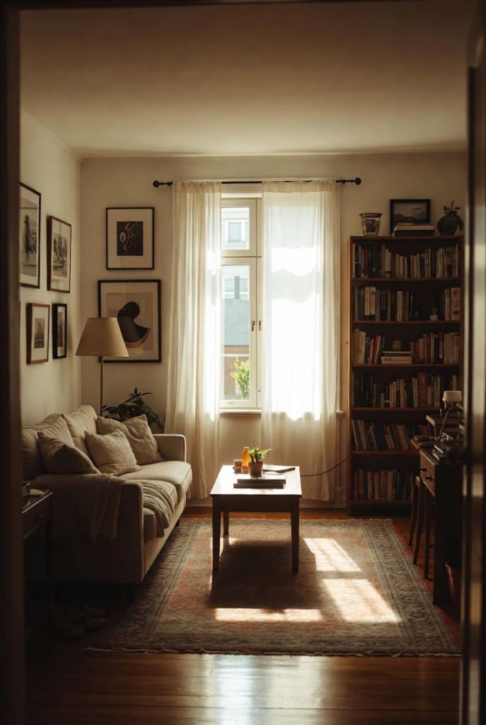
Laugh, Learn, and Layer On
Design mistakes are part of the process — and they make the best stories! The key is stepping back, laughing at what’s not working, and making small adjustments that honor how you actually live.
Have you ever made one of these classic mistakes (or spotted one in someone else’s house)? Share your funniest design oops in the comments!
With love (and a little gentle teasing), friends! 🏠