By Joanthan Adler, The Playful Modernist
Witty, irreverent, fun. He makes you laugh while making you think about your lamp.
Hey friends! Every December the design world holds its breath for Pantone’s Color of the Year, and this time around they gave us Cloud Dancer — a soft, airy white (PANTONE 11-4201) described as “billowy,” “serene,” and a calming reset in a noisy world. Other brands picked their own favorites too (warm khakis, deep browns, etc.), but Pantone’s choice is the one everyone’s talking about.
So… should you actually care? Let’s talk about it honestly.
What Cloud Dancer Actually Looks Like
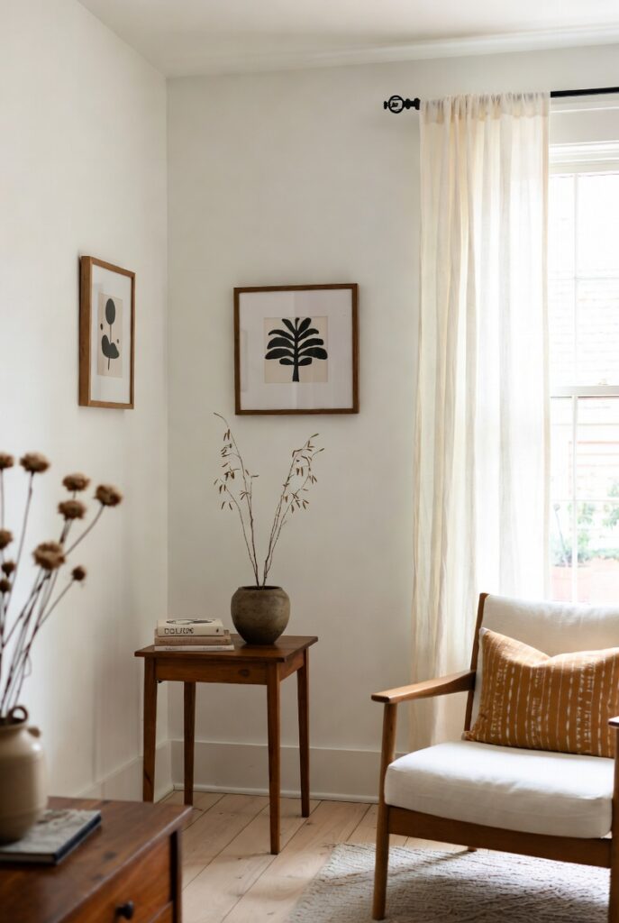
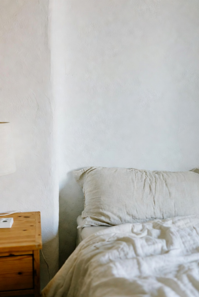
It’s not a cold, optical-bright white. Cloud Dancer sits in that gentle middle ground — a soft white with balanced warm and cool undertones that feels quiet and airy rather than sterile. In real homes it reads as a fresh, breathable neutral that plays beautifully with natural light and organic materials.
Think of it as a sophisticated blank canvas rather than a stark gallery wall.
Why Pantone Chose It (and Why It Resonates)
In a world that feels constantly overstimulated, a quiet white makes cultural sense. It’s meant to signal calm, clarity, and a desire to reset. In interiors it pairs especially well with warm woods, stone, linen, and the earthy tones we’ve been loving — terracotta, olive, espresso.
It doesn’t shout. It simply makes everything around it feel more intentional.
Do You Need to Repaint Your Whole House?
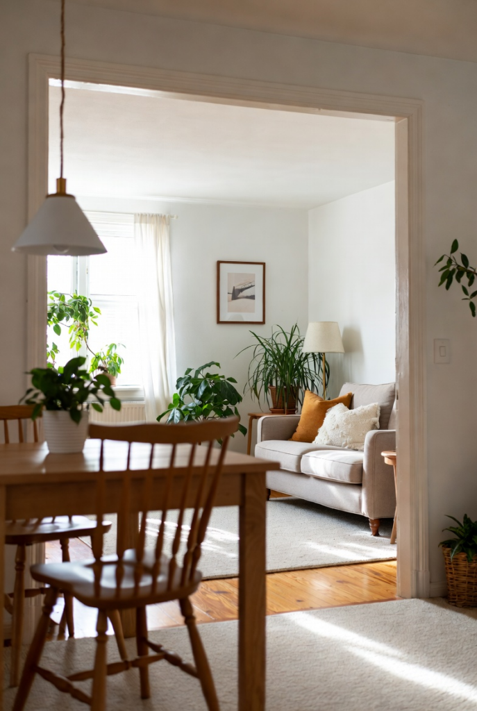
Honest answer: no. Color-of-the-year picks are wonderful for inspiration and conversation, but they are not rules. If your current walls already feel good in your lighting and with your furniture, keep them. Trends come and go; your actual daily life stays.
The smartest move is often using the new color in smaller, reversible ways — a fresh set of linens, a painted door, new curtains, or one accent wall.
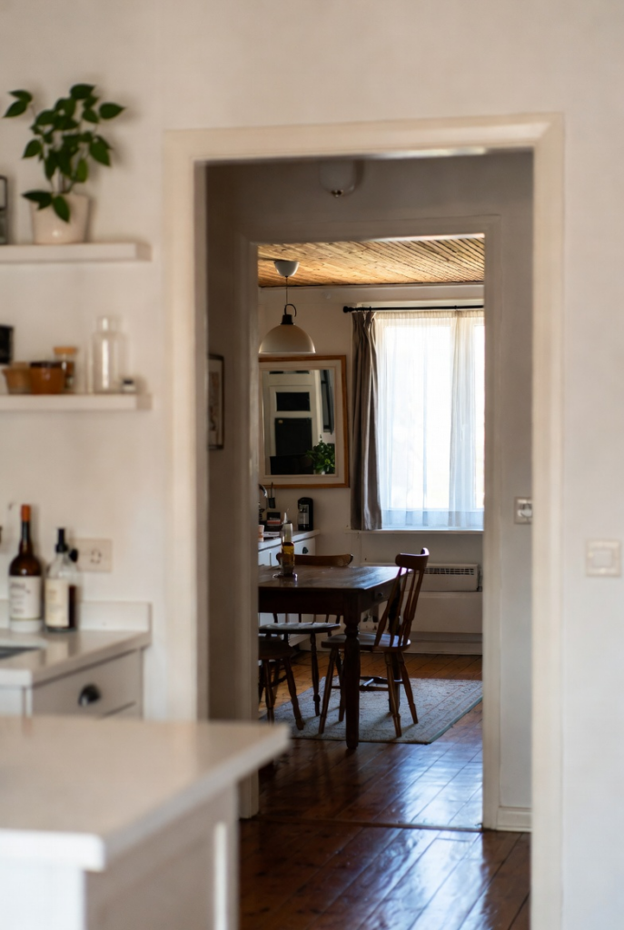
How to Use It (or Skip It) Beautifully
If the shade speaks to you, try it on trim, a ceiling, open shelving backdrops, or bedding. Pair it with the natural materials and earthy accents already in your home so it feels layered rather than clinical. If it doesn’t speak to you at all, ignore it completely and keep choosing colors that make you feel at home.
The best homes in 2026 will still be the ones that reflect the people living in them — not the latest Pantone announcement.
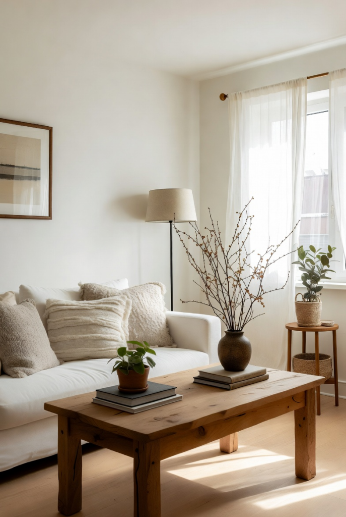
Trends Are Optional. Feeling at Home Isn’t.
Cloud Dancer is a lovely, quiet white that many people will enjoy this year. Use it if it makes your heart happy. Skip it if it doesn’t. Either way, your home is already successful when it supports the real life happening inside it.
Are you team Cloud Dancer, or are you sticking with the colors you already love? Tell me in the comments!
With clarity and calm (and zero pressure), friends! ☁️