By Kelly Wearstler, The Bold Maximalist
Fearless, vibrant, trend-setting. She pushes limits and dares readers to be brave.
Hey friends! After years of safe neutrals, we’re finally seeing a joyful return to color in 2026 — and not just any colors. Designers (and homeowners) are pairing hues in fresh, unexpected ways that feel both modern and timeless.
These surprising color combinations are bringing energy, warmth, and personality into homes without overwhelming them. Let’s look at some of my favorite duos that I’m seeing everywhere right now.
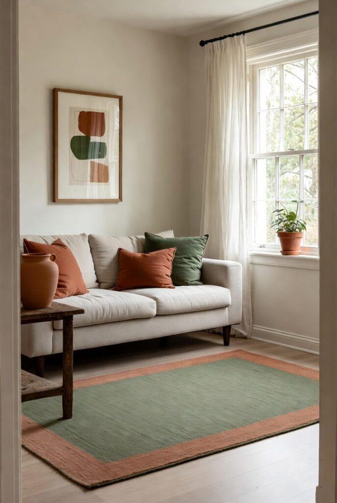
Terracotta + Sage Green
This earthy combination feels grounded yet fresh. Terracotta brings warmth and energy, while sage green adds calm and nature-inspired balance.
How it works: Use terracotta on a statement sofa or accent wall and weave in sage through plants, pillows, and art. It’s perfect for living rooms and kitchens that need a cozy, organic feel.
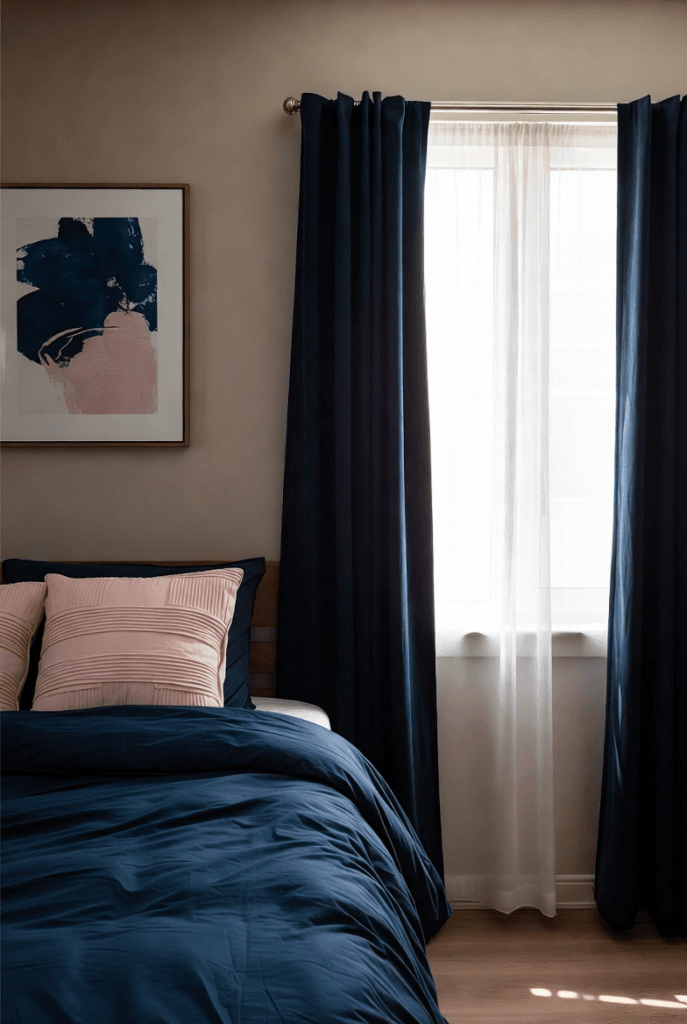
Deep Navy + Blush Pink
This duo offers beautiful contrast — the depth of navy grounds the space while blush pink softens it with romance and warmth.
How it works: Try navy walls with blush bedding in bedrooms, or navy kitchen cabinets with blush accents. It feels sophisticated but still approachable and livable.
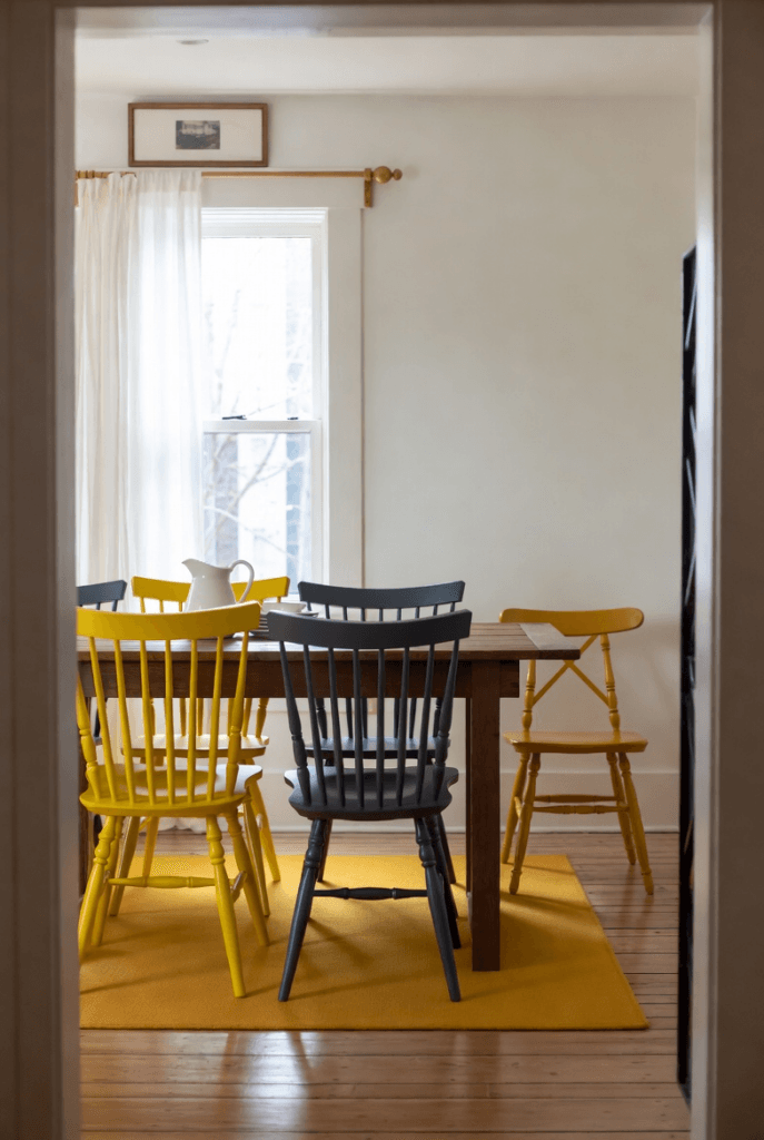
Mustard Yellow + Charcoal Gray
Mustard brings sunny optimism while charcoal adds sophistication and balance. This pairing feels modern and energetic without being too bright.
How it works: Use mustard on dining chairs or pillows against charcoal walls or a dark sofa. It’s especially great for open-plan living and dining areas.
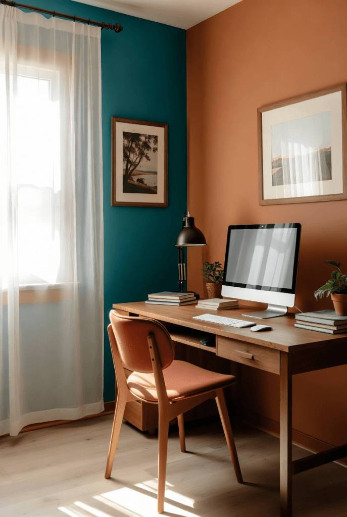
Teal + Warm Terracotta
Teal offers a fresh, calming presence while warm terracotta grounds it with earthy comfort. This combination feels both current and timeless.
How it works: Great for creative spaces or reading nooks. Layer teal on an accent chair with terracotta rugs and accessories for a space that feels inspiring and cozy.
How to Make These Duos Work in Your Home
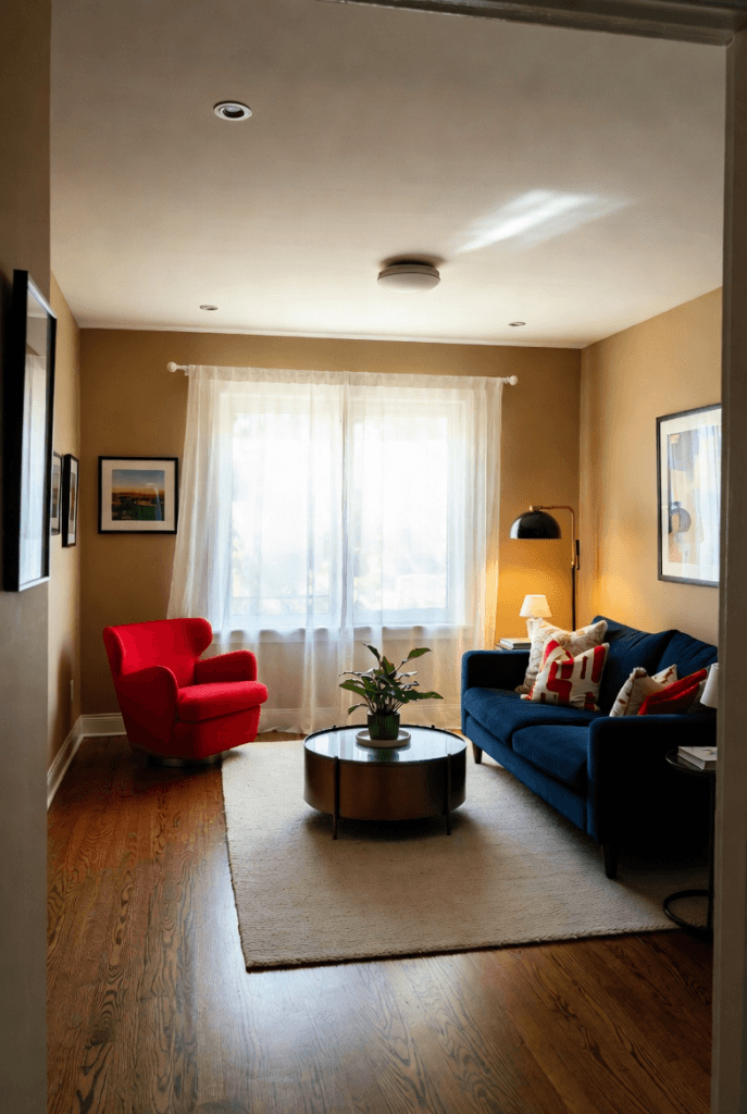
Start small — introduce one new color through pillows, art, or a throw, then build from there. Always include plenty of neutrals and natural textures to let the colors breathe. The goal is harmony, not competition.
Which of these unexpected color duos are you most drawn to? Let me know in the comments — I’d love to help you incorporate them into your home!
Happy coloring, friends! 🏡