Hey everyone! It’s that time of year when I start spotting the color shifts happening in real homes (and not just on Pinterest mood boards). As an interior decorator who spends her days in clients’ houses, I’m always excited when fresh combinations bubble up. 2026 is shaping up to be the year of unexpected color duos — pairings that feel fresh, grounded, and surprisingly livable.
These aren’t the loud, clashing trends of the past. They’re thoughtful marriages of warm and cool, bold and quiet, that create depth and personality without requiring a total room makeover. Today I’m sharing the three duos I’m seeing everywhere and how to make them work in actual, everyday homes.
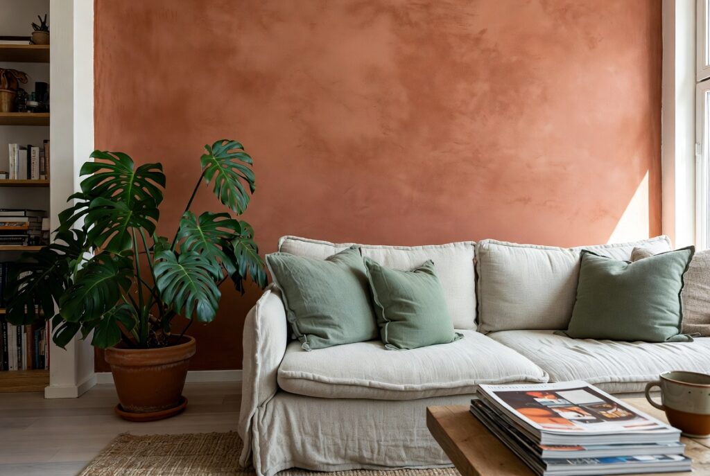
Terracotta + Sage Green
This earthy warm-and-cool pairing feels like a natural evolution from the beige-and-green phase we’ve been in. Terracotta brings that cozy, grounded energy while sage keeps things fresh and serene.
In living rooms (like the one pictured), try a terracotta accent wall or sofa with sage pillows and plants. It works beautifully in kitchens too — terracotta tiles or dishes against sage cabinetry. The combination feels organic and calming, perfect for homes that actually get lived in.
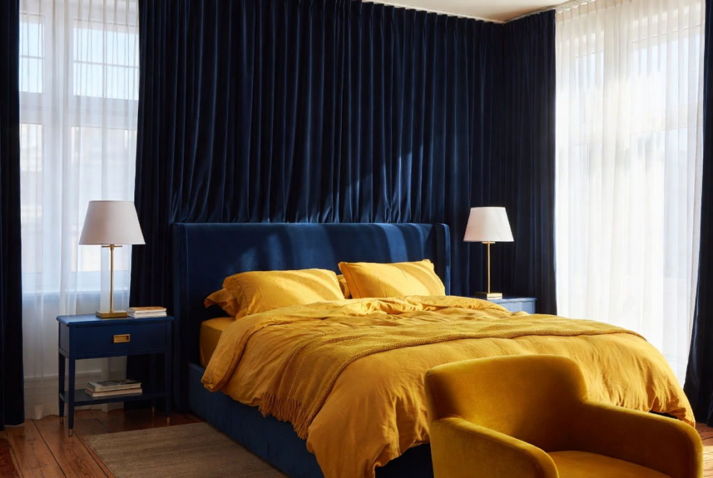
Deep Navy + Mustard Yellow
Navy has been a staple, but pairing it with a golden mustard yellow is giving serious 2026 energy. The depth of navy provides sophistication while the mustard adds unexpected warmth and cheer.
The bedroom above shows how rich this duo can feel without being dark or heavy. Use navy on larger pieces (headboards, sofas, curtains) and mustard in smaller doses — throws, artwork, or upholstery accents. It photographs beautifully in natural light and feels cozy in the evenings.
Forest Green + Rust Orange
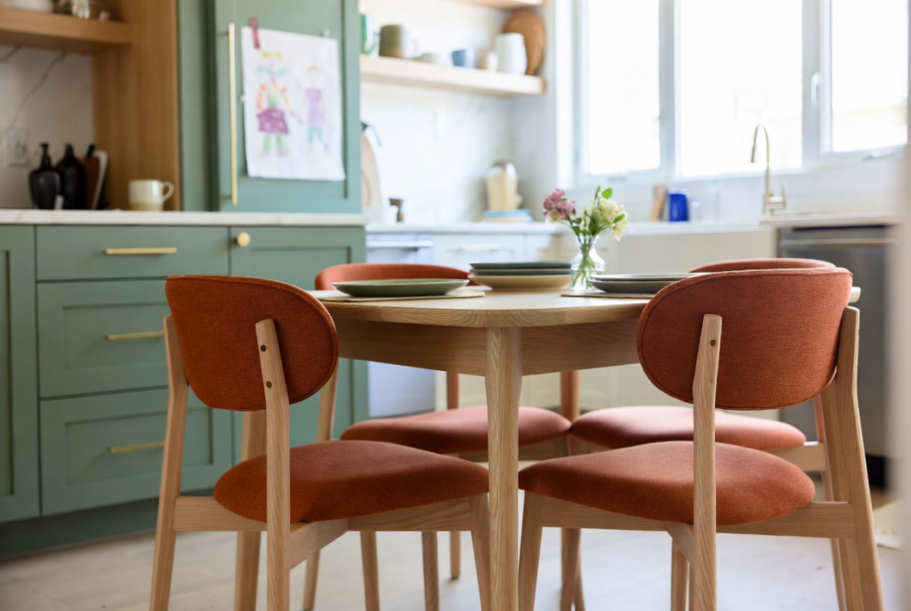
This one surprised even me with how well it translates to real homes. Forest green grounds the space while rust orange adds that perfect hit of warmth and energy. It’s especially strong in kitchens and dining areas, as shown in the photo.
Try forest green cabinetry or a feature wall with rust-colored dining chairs or bar stools. It feels current but timeless — like it’s always belonged there.
How to Make These Duos Work in Your Home
- Start small: Introduce the bolder color through movable pieces (pillows, throws, art) before committing to paint or upholstery.
- Balance with neutrals: Let warm whites, soft beiges, and natural woods do the heavy lifting.
- Lighting is key: These combinations shine in homes with good natural light. Layer lamps for evening warmth.
- Texture matters: Mix matte, woven, and soft fabrics to prevent any duo from feeling flat.
The beauty of these 2026 duos is how adaptable they are. They add personality without dating your home. Which one are you most tempted to try? Have you already experimented with an unexpected pairing that’s working surprisingly well?
Share in the comments — I love seeing your real-home color stories and might even feature a few in an upcoming post!
Wishing you bold (but livable) color adventures, — Your go-to interior decorator who’s always chasing the next perfect palette ✨